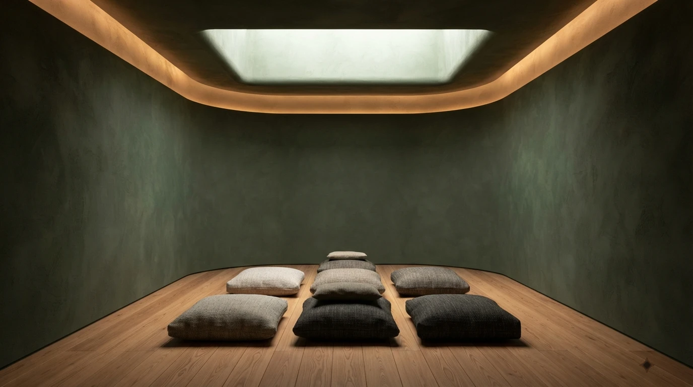
The problem in luxury wellness projects is rarely choosing wrong colours in absolute terms: it is choosing colours that work aesthetically in photography but produce activation rather than calm when the guest is physically present. A saturated emerald green photographs better than a desaturated moss green. But under that emerald, the sympathetic nervous system stays active. Under the moss green, it has permission to deactivate.
How colour affects the nervous system: what science documents
Environmental psychology research has established three primary mechanisms by which colour affects the observer's physiological state. First, saturation: highly saturated colours — bright, intense — produce greater sympathetic nervous system activation than desaturated or muted colours. Second, colour temperature: warm colours (red, orange, yellow) produce greater activation than cool ones (blue, green, violet), with a neutral zone in very desaturated greens and earth beiges. Third, contrast: high contrast between colours produces cognitive activation; low contrast — monochromatic or analogous palettes — produces calm.
The most studied colour in wellbeing and recovery contexts is green. Research in the field of architect and neuroscientist Eve Edelstein establishes that desaturated greens — sage green, moss green, earth green, eucalyptus green — produce a measurable reduction in heart rate and cortisol levels when applied as the dominant colour in a space. The proposed mechanism is the unconscious evocation of safe natural environments: the human brain has a biological calm response to the green of vegetation that has been encoded for hundreds of thousands of years. The green of plants was not a threat to homo sapiens. Red could be.
Desaturated green: the colour of demonstrated wellbeing
Moss green, sage green and eucalyptus green are the tones with the strongest evidence base for luxury wellness spaces in 2026. Valspar selected Warm Eucalyptus as its 2026 Colour of the Year precisely for this reason: a muted green with warm undertones positioned between neutral and nature-inspired palettes, producing restorative and mindful interior environments. Demand for these tones in hotel wellness projects has multiplied in the last two years.
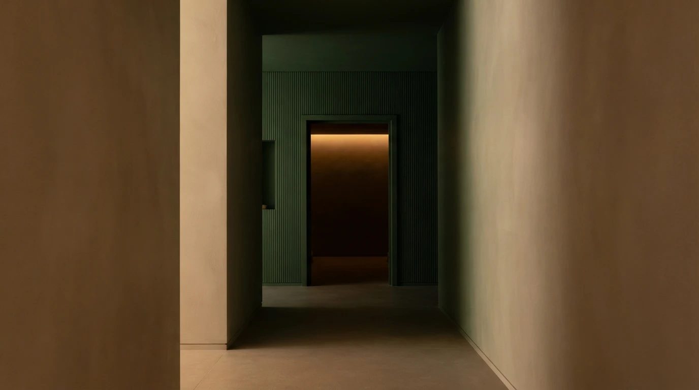
Correct application of desaturated green in wellness spaces has three conditions. First, saturation must be low — between 15% and 35% saturation in the HSL system — to avoid the stimulation that saturated green produces. Second, the colour temperature of the green must be warm — with yellow or brown undertones — and not cold (with blue undertones), because cold saturated greens evoke artificial environments (hospital green, office green) that produce the opposite response to that desired. Third, wall green must be combined with natural materials of visible texture — timber, stone, linen — that amplify the biophilic evocation. A moss green over a smooth plaster wall with a plastic finish kills the biophilic effect the colour seeks.
Recommended application zones: meditation room (main wall or all four walls in soft tone), post-treatment rest zone, yoga room, spa changing rooms. Zones where green is not the optimal choice: indoor pool (where light reflection from water on a green wall can produce an undesirable algae effect), hammam (where the tradition of azulejo and white marble has its own cultural and technical logic).
Soft terracotta: warmth without activation
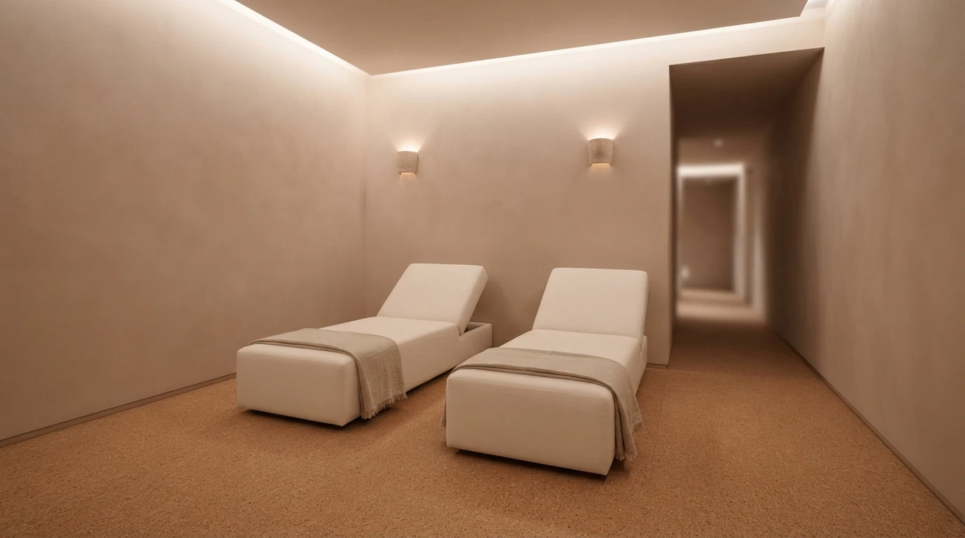
Terracotta in very desaturated tones — almost beige with a reddish-brown tint — is the colour that has grown most in luxury wellness projects in Spain and Portugal over the last three years. Not the saturated terracotta of the nineties: a colour that recalls clay, mud, the red earth of the Alentejo or Extremadura. A colour with history on the Iberian Peninsula and with an emotional charge of warmth, antiquity and connection to the territory.
Soft terracotta works particularly well in spa transition and reception zones: the spaces where the guest enters from outside and needs a colour that welcomes without activating. The physiological mechanism: warm earth tones produce a safety and belonging response that cold neutrals do not generate. The trap of terracotta: saturation. An excessively saturated terracotta — intense orange tones — produces sympathetic activation and can increase the perceived temperature of the space, which is counterproductive in rest zones in summer. The correct terracotta for wellness is almost neutral: it passes from orange to earth when looked at directly but appears almost beige in peripheral vision.
Indigo blue: heart rate reduction in silence zones
Indigo blue — between navy blue and deep violet, with very low luminosity — is the colour with the most potent documented effect on heart rate reduction. In spaces of deep meditation and inner silence work, indigo on the focus wall — the wall the practitioner looks at during the session — produces a measurable physiological deceleration that facilitates the deepest contemplative states.
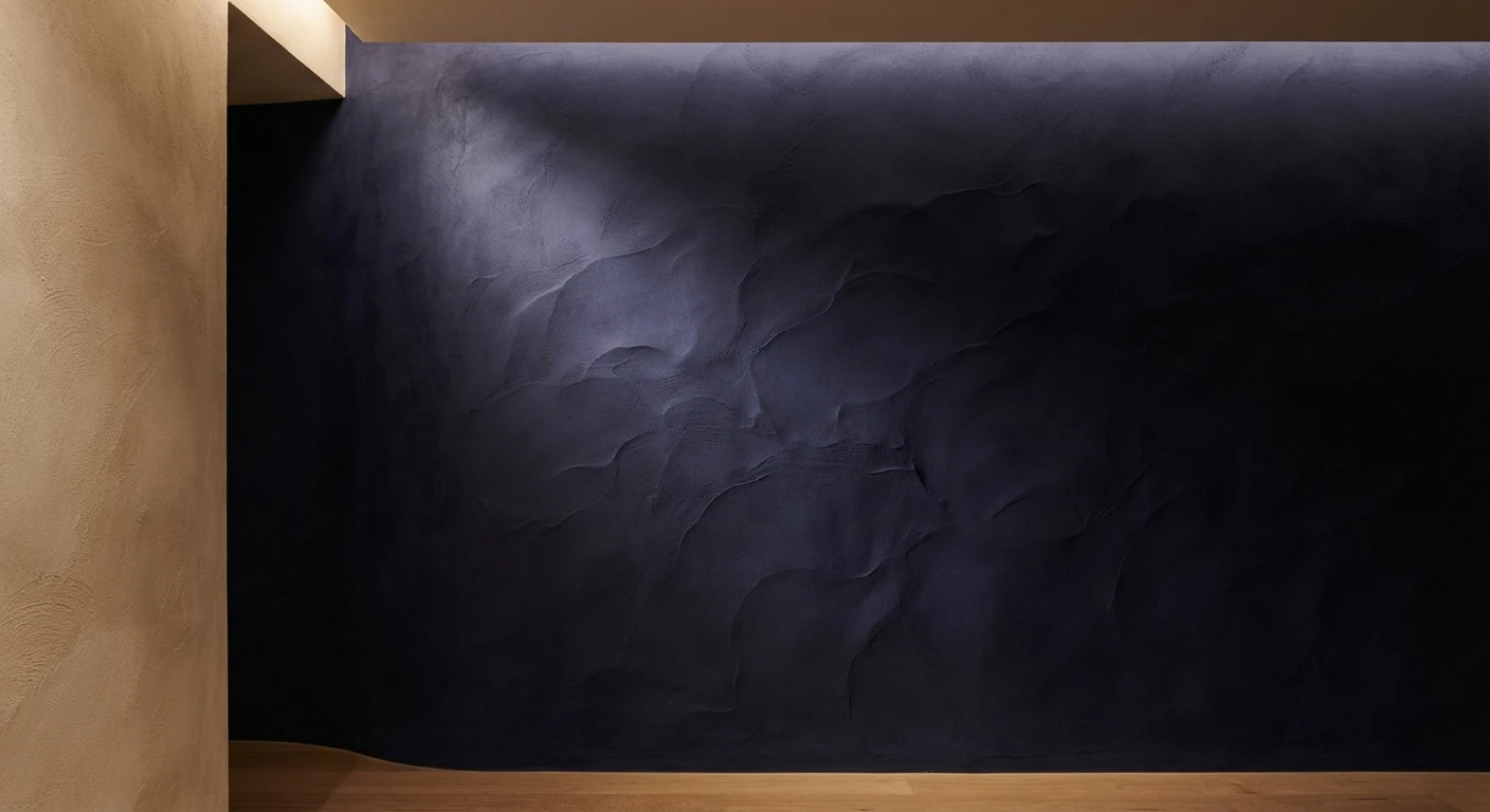
Indigo is a delicate colour to use in wellness spaces because incorrect application produces the opposite effect: indigo blue on every surface of a small space produces a sense of confinement that activates the sympathetic system. Correct application is punctual: one accent wall at the meditation focus, a panel at the head of the rest zone, the main face of the floatation room. The rest of the space in warm neutrals that contrast softly with the indigo.
Light interacts particularly with indigo: under 2,700K (warm) light, indigo shifts toward violet and acquires a visual depth that produces a sensation of space and mystery. Under 4,000K (neutral or cool) light, indigo becomes cold and flat. The colour temperature of lighting is a design variable that must be specified simultaneously with wall colour, never independently.
Warm neutrals: the base that allows everything else
Warm neutrals — whites with a warm grey base, deep beiges, sands, greys with yellow undertones — are the correct base for the great majority of luxury wellness spaces. Their function is not to produce an active wellbeing effect: it is to not interrupt the effect produced by the other elements of the space — light, materials, acoustics, temperature.
Pure cold-based white — RAL 9010 or standard gloss white — is the worst possible neutral for a wellness space. It produces visual activation through reflectivity that competes with any intention of calm. Under 2,700K light, pure white appears unpleasantly yellowish. Under 4,000K light, it reads as clinical. The correct white for wellness is broken white — grey base, cream base, earth base — that in practice appears almost white but absorbs light in a soft way that pure white does not. Zero saturation does not exist in the neutrals that work well: all carry a colour hue — warm or cool — that determines their behaviour in the space. Choosing the correct neutral for a wellness space is choosing the type of nature that space evokes unconsciously, not choosing "a generic neutral colour".
The most frequent error: colour in photography vs colour in presence
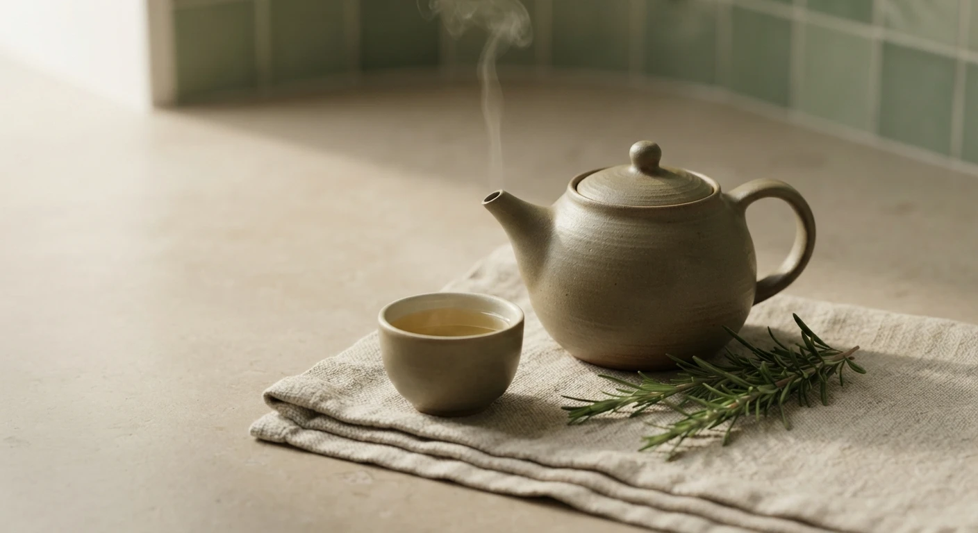
The most frequent colour error in luxury wellness projects has a precise name: optimising for photography instead of for experience. Colours that photograph best under professional lighting — saturated tones, high contrast, glossy whites — are frequently those that produce the least wellbeing when the guest is in the space without a photographer managing the light.
The difference between a colour on a paint chart sample and that same colour on a 20 square metre wall under changing natural light is enormous. Tones that appear soft in a sample intensify when covering large surfaces. Tones that appear cold in a sample warm up under afternoon Atlantic light. Colour must always be verified in real use conditions: samples painted on the actual wall, at the peak usage time of the space, with the artificial lighting the finished project will have.
A practical rule that experienced wellness interiorism studios apply: if the colour chosen for a meditation or rest zone produces a "how beautiful" response when seen in a sample, it is probably too saturated. The correct colour for wellness produces a "how calm" response. The beauty of a wellness space must be perceived diffusely, not as an element of attention that demands to be looked at.
Wellness space design with colour psychology criterion in boutique hotels and luxury villas in Spain and Portugal is one of Véline Interiors' specialisms. If you have a project and want to evaluate the palette with physiological as well as aesthetic criterion, the conversation is open.
Véline Interiors · Wellness Design
Have a wellness project in development?
We evaluate the colour palette with physiological as well as aesthetic criterion.
Submit your project →