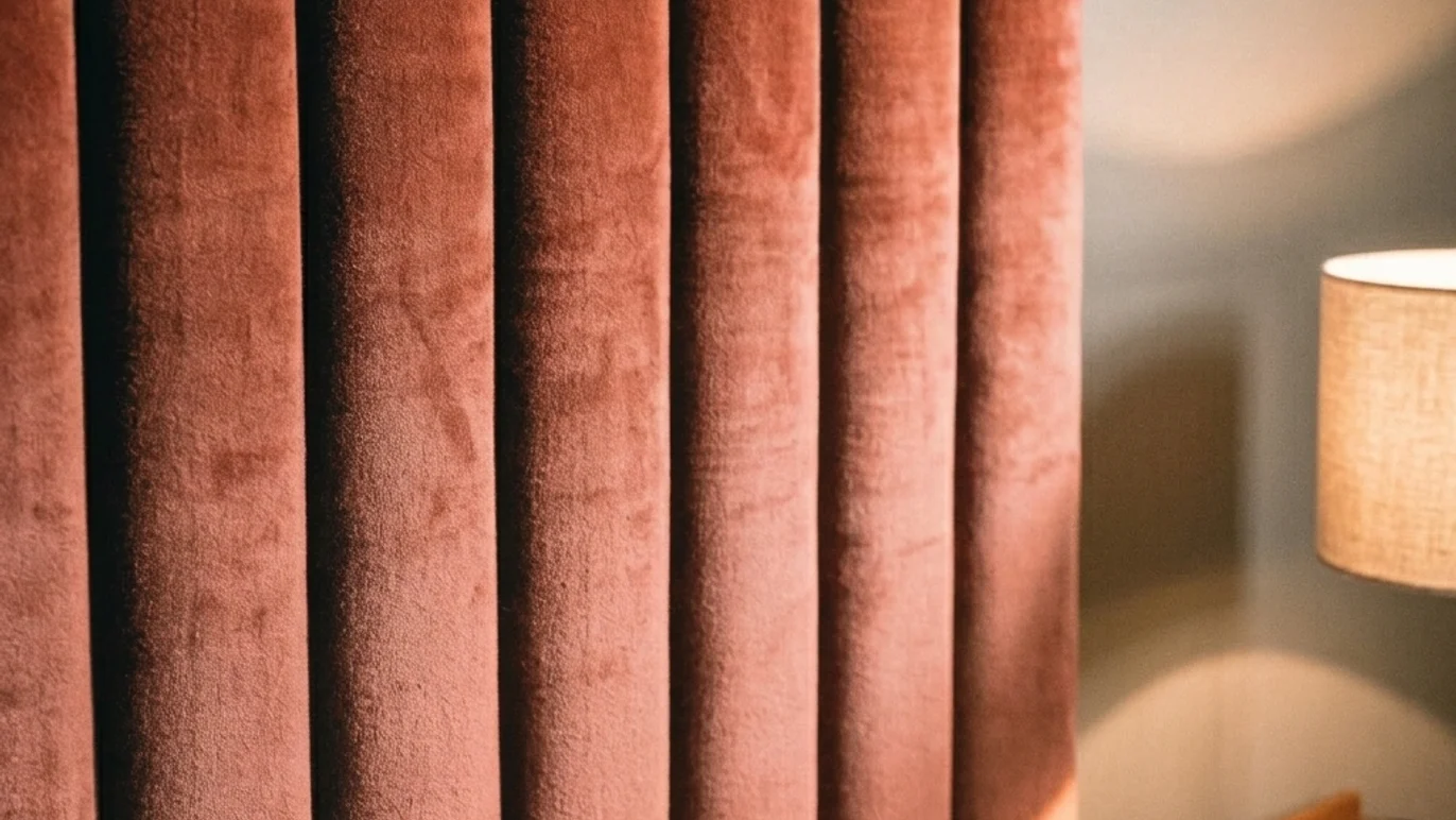
A hotel that shouts colour has a seasonal shelf life. One built on the right palette holds for a decade without redesign. The difference isn't taste — it's method. And the method starts with understanding what makes a colour work in a hotel corridor and fail in a living room.
Why quiet luxury starts with what you don't notice — the neutral base
A quiet luxury colour palette doesn't begin by picking an attractive colour. It begins by removing the ones competing with each other. The base — 60 to 70% of each space — is built from warm neutrals: greige, sand, taupe, cream with a subtle yellow or red undertone. Never a pure cold white, which under hotel artificial lighting reads clinical rather than elegant.
This base has to solve something residential decoration rarely faces: it must perform identically in a north-facing room and a south-facing one, under LED temperatures that vary slightly between suppliers even within the same renovation. A poorly calibrated neutral reads ash grey in one orientation and yellowish in another. That inconsistency, multiplied across a hundred rooms, is the first thing a trained eye catches walking through a hotel — and the first thing a discerning guest feels without naming it.
That's why the neutral base of any hotel interior design project is always tested under two different light temperatures before any material is approved. It isn't an optional step — it's what stops the palette breaking between floors.
The 60/30/10 rule applied to guest rooms and public areas
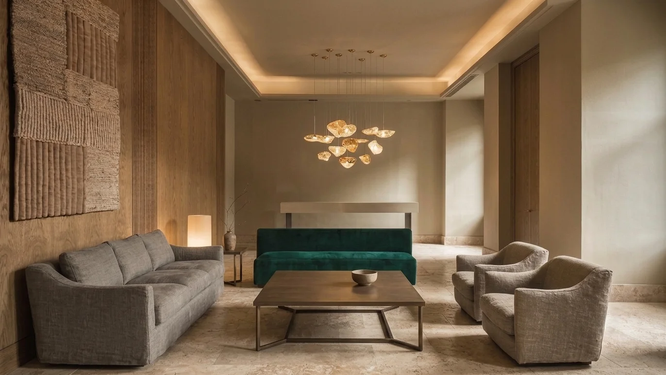
The classic 60/30/10 proportion is almost always misapplied because it's treated as decorative rather than functional. In a hotel project, that proportion translates into construction decisions, not styling ones.
The 60% covers fixed surfaces — walls, floor, ceiling, built-in joinery. There's no margin for error here, because correcting it means closing rooms. The 30% is medium-rotation textiles — curtains, bed linen, upholstery — replaced every five to eight years, which can absorb controlled tonal variation within the same colour family. The 10% is the accent: cushions, art, metal details, one characterful furniture piece. It's the only layer that can change within a short maintenance cycle without touching the fabric of the building.
This operational reading is what separates a genuine hotel interior design project from a decoration blog recommendation: the palette isn't an isolated aesthetic choice, it's a ten-year maintenance plan disguised as visual criteria.
Colour temperature and artificial light — the mistake that gives away a generic hotel
Almost no article on quiet luxury palettes discusses colour temperature, and it's the most common technical failure in hotel renovations. Hospitality runs predominantly on warm artificial light, between 2700 and 3000 Kelvin, because it produces a sense of wellbeing and reduces visual fatigue during long stays. A neutral chosen under showroom or office light — cooler, between 4000 and 5000K — transforms completely once installed under that warm light: grey turns greenish, white shifts to an unintended yellow.
The operational rule is simple: any colour sample gets approved only under the project's definitive light temperature, never under showroom daylight. This matters twice as much in wellness spaces, where light tends to be dimmer and more directional, and a poorly calibrated neutral can read dull instead of serene — the difference between calm and neglect.
The single accent — where and why to introduce a saturated colour
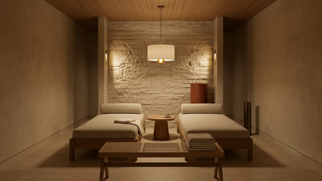
The temptation in any quiet luxury project is to avoid saturated colour altogether. That's as common a mistake as the opposite one. A deep forest green, a terracotta, a burgundy, introduced with discipline at a single point per space — a headboard, a bench, a piece of joinery — doesn't break the palette's calm. It makes the space memorable. The difference between a neutral hotel and a neutral, forgettable one sits exactly there.
The rule is one of discipline, not taste: one saturated accent per space, never two. And that accent gets chosen before the rest of the design, not tacked on at the end — because it sets the temperature for every neutral around it. In private villas, where the client has more room for personal identity than in a branded hotel, this accent can shift from room to room as long as it stays within the same overall tonal family.
What is a quiet luxury colour palette?
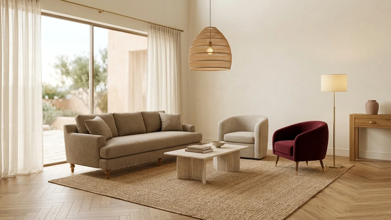
It's a palette built on a base of warm neutrals, with fixed proportions between permanent surfaces and rotating elements, and a single saturated accent per space. Its purpose isn't decorative — it's to hold visual and functional coherence for years without needing a redesign.
Applying the palette without losing coherence across 40 to 200 rooms
The biggest risk in scaling a quiet luxury palette isn't choosing the wrong colours — it's losing control of batch variation. The same paint or fabric shade, manufactured across different batches over a months-long renovation, can show perceptible differences to a trained eye. The fix isn't cosmetic, it's procedural: fix the exact colour code, never the commercial name, and require a physical sample from every batch before installation.
That discipline is what separates well-executed contemporary neoclassical design from a well-drawn intention on a moodboard. A quiet luxury colour palette isn't validated at the client presentation. It's validated in room 180, a year after opening, still looking exactly like room 12.
Véline Interiors · Hospitality Design
If your project needs this level of criteria before the first coat of paint, the conversation is open.
We design colour palettes for hotel projects that hold for a decade without redesign.
Submit your project →