Quiet luxury was not born in a trends magazine. It existed long before anyone gave it a name. It is the hotel room where you sit on the bed and don't want to leave. The lobby where check-in feels like a minor formality because the space has already done the work. The villa where the materials look good on day one and better on day five.
What these spaces share is not a style. They are not all neoclassical, nor all minimalist, nor all part of any codified movement. What unites them is a way of making decisions: nothing is accidental, nothing is there to impress in a photograph, everything responds to how the space will be used and how the person inside it will feel.
In interior design, quiet luxury is exactly that: criteria before aesthetics. A set of values applied to space that produces environments which need no explanation, which do not age with trends, and which generate a perception of quality that the user experiences without being entirely able to name it.
This article explores what that criteria means in concrete project decisions: materials, proportions, light and the relationship between what is added and what is deliberately left out.
What quiet luxury is not
The first confusion is thinking that quiet luxury is expensive minimalism. It is not. Minimalism works through subtraction: the less, the better. Quiet luxury works through selection: every element present has been chosen for a reason and executed with enough quality to be felt.
The second confusion is thinking it is a specific decorative style. It is not that either. A quiet luxury interior may have plaster mouldings or not. It may have a neutral palette or incorporate colour with intent. It may reference classicism or ignore it entirely. What it cannot be is generic: the absence of decision is not quiet luxury — it is a budget poorly spent.
The third confusion — the most costly in hospitality — is thinking it is a matter of price. There are five-star hotels that lack this criteria and thirty-room boutiques that have it impeccably. The difference is not in how much is spent but in when and how design decisions are made.
Quiet luxury is the absence of visible effort. The space does not shout its quality: it demonstrates it in the weight of a door, the fall of a curtain, the temperature of the light at six in the evening. The guest does not make a mental list of what they like. They simply do not want to leave.
This criteria guides all Véline Interiors hospitality and residential projects.
Materials as an argument
A quiet luxury space is built from the materials outward, not from the image inward. The question is not "how do I want this to look?" but "which materials respond well to use, to the passage of time, and to the place where we are?"
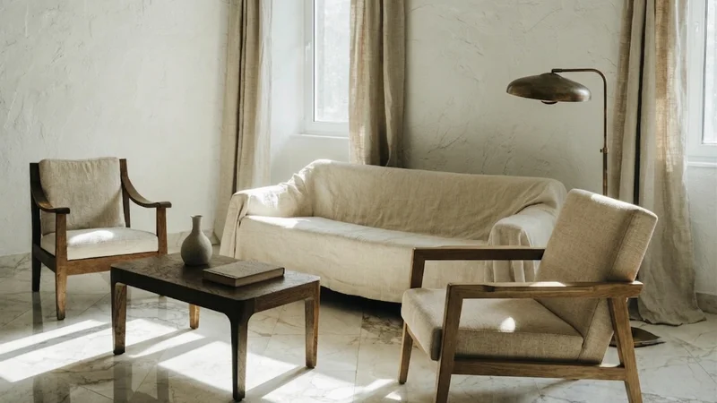
That has concrete consequences. In Spain and Portugal, where buildings have history and the climate has character, the materials that work best under this criteria tend to be those of the territory itself: Estremoz or Macael marble with its warm cream tone, dark oak timber that absorbs light rather than reflecting it, lime plaster on walls that breathes and ages gracefully, linen in textiles that wrinkles well and improves with every wash.
None of these materials are new. Their relevance does not depend on being fashionable: it depends on being honest. They show what they are, accept wear as part of their character, and do not need intensive maintenance to remain relevant. That material honesty is itself a gesture of quiet luxury: choosing something that will last over something that will impress.
Combination matters too. Quiet luxury is not uniformity — not everything needs to be the same material or the same tone. It is coherence: each chosen material sharing with the others a common reading of temperature, texture and intention. Cream marble with dark oak and aged brass have different temperatures but the same visual density. They work together because none of them competes with the others.
The design of wellness spaces — where materiality directly impacts the sensory experience — applies these same criteria. We detail this on our wellness page.
Proportion as a silent tool
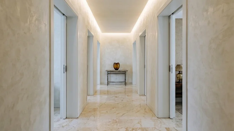
There are spaces that feel right without anyone being able to explain why. Ceilings that seem higher than they are, rooms that feel more generous than they measure, corridors that invite you to slow down. Almost always, behind that feeling is a proportion decision well made.
Proportion is probably the least visible design variable and the one with the greatest impact on the real experience of a space. It does not appear in photographs the same way a material or a lamp does. But it is what determines whether a room feels like a place to rest or a container to sleep in.
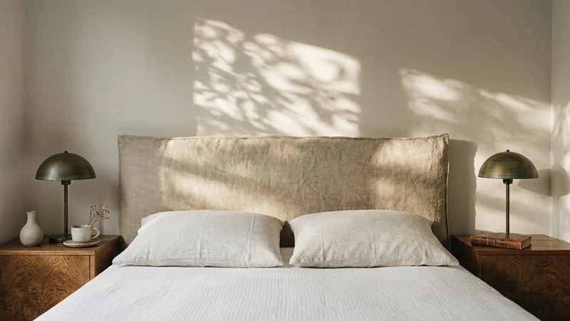
In hospitality, some proportion decisions have a disproportionate impact relative to their cost. A clean moulding at the ceiling-to-wall junction — not ornate, simple in profile — can make a room with low ceilings read as taller. A door opening that reaches the ceiling rather than stopping at 2.10 metres changes the reading of the entire space. A headboard that integrates with the wall rather than floating above it gives scale to the bed without requiring more square metres.
None of these decisions require a specific style. They work equally well in an interior with classical references as in one of pure contemporary lines. What they require is being made at the right time: in the project stage, when there is still room to act on the geometry of the space, not in the decoration stage, when the space is already closed and only the surface remains.
Proportion is silent because when it is well resolved, it goes unnoticed. What is noticed is the absence of discomfort. And in design, the absence of discomfort is an extraordinarily difficult result to achieve.
What is left out
One of the most characteristic decisions of quiet luxury is the decision not to add. There is a moment in any interior design project when the space already has everything it needs. The temptation — from the client, sometimes from the designer — is to add one more piece, one more object, one more point of colour. Quiet luxury is recognising that moment and resisting that temptation.
This is not minimalism. Minimalism works toward emptiness as an aesthetic goal. Quiet luxury works toward sufficiency: the space has everything it needs to function and to move, and nothing of what is surplus. The difference is that a quiet luxury space can have layers, textures, objects with history — but all of them respond to a logic, none of them are there out of inertia or out of fear that the space might look bare.
In hospitality, this has a direct operational implication: spaces with fewer superfluous elements are easier to maintain, harder to deteriorate and more coherent throughout the useful life of the project. A lobby with four pieces chosen with criteria withstands the passage of time better than one with twenty decorative pieces accumulated without hierarchy.
The question that defines quiet luxury in interior design is not "what can I add to make this look better?" It is "what can I remove without this losing anything essential?" When that question has no answer — when every element present has a reason for being there — the space is finished.
The space that needs no explanation
A quiet luxury interior needs no one to describe it. The guest who enters a room like this does not think "how elegant" or "how luxurious" — they feel, without thinking it clearly, that they are in the right place. That feeling is not manufactured with a high budget or a particular style. It is built with decisions made at the right moment, with materials that respond well, with proportions the eye accepts without effort, and with the discipline not to add anything that is not necessary.
It is the hardest result to achieve in interior design. And the one that lasts longest.
Véline Interiors · Quiet Luxury
Does your project look for this criteria?
If this criteria matches your hotel or residential project in Spain or Portugal, the conversation is open.
Present your project →